Inside the Design of Celigo’s Agent Builder
 Updated Apr 7, 2026
Building the Agent Experience

Celigo’s Agent Builder brings agentic workflows into the platform as a flow-native, structured, testable, and trustworthy experience for intelligent automation work.
What started as a new product concept quickly became a broader design challenge: how do you turn “agent” from an idea into something builders can actually configure, trace, govern, and use inside real Celigo workflows?
That meant designing not just the agent itself, but the full builder experience: how agents fit into flows, how users test and refine them, and how trust is built through traceability, guardrails, and control.
Product design Q&A
We spoke with Nishant Bali (Lead Product Designer), Dilip Singh (Product Designer), and Susanne Soliman (Head of UX) about how Celigo designed Agent Builder to feel native to the platform.
They shared what it took to make agentic workflows feel clear, controllable, and usable in real builder workflows.
Where did the design process start?
Before we ever put pen to paper, we needed to immerse ourselves in the problem space.
The very first thing we needed to validate was whether we were even solving the right problem. That meant immersing ourselves in everything (existing research artifacts, business goals, product requirements) until we had a clear, confident picture of not just what we were building, but for whom.
From there, we dove into competitor research to understand how others in our space were approaching this challenge. But the real gold mine was closer to home: Celigo’s continuous discovery interview repository, a living archive of primary research built from ongoing conversations with our customers.
That’s where the sharpest, most honest insights live.
With a strong hypothesis in hand, it was finally time for our favorite part: pen and paper.
We started sketching potential user journeys first, getting the flow of the experience out of our heads and onto paper before worrying about any specifics. Rough ideas, messy diagrams, lots of scribbles.
What was the design mission for Agent Builder?
To design an experience that puts humans confidently in control of AI: making agentic workflows transparent, governed, and trustworthy at every step.
What design traps were you trying to avoid from the start?
From the very beginning, there were two things we were deeply afraid of.
The first was building a black box. There was an initial prototype of Agent Builder that looked minimal and visually aesthetic, but completely fell apart in day-to-day use — where the agent just does things, and the user has no idea why, no way to course-correct, and no way to undo. That’s not empowerment, that’s anxiety.
AI that users can’t see into, question, or control isn’t a feature. It’s a liability. We needed users to feel genuinely in control at every step, not like they were handing the keys over to something they didn’t fully understand or trust.
The second fear was equally important: that Agent Builder would end up feeling like a separate product. We did not want to design an “AI tab” you click into and suddenly forget you’re in Celigo.
That kind of fragmentation quietly kills adoption.
Users build confidence and fluency with a platform over time, and the moment something feels foreign or disconnected, that trust evaporates. We’d seen it happen across the industry; companies bolt on an AI layer, it feels out of place, and users never integrate it into their real workflows.
So those two things became our guiding principles. Whatever we built had to be transparent enough to trust and native enough to feel like it had always been there.
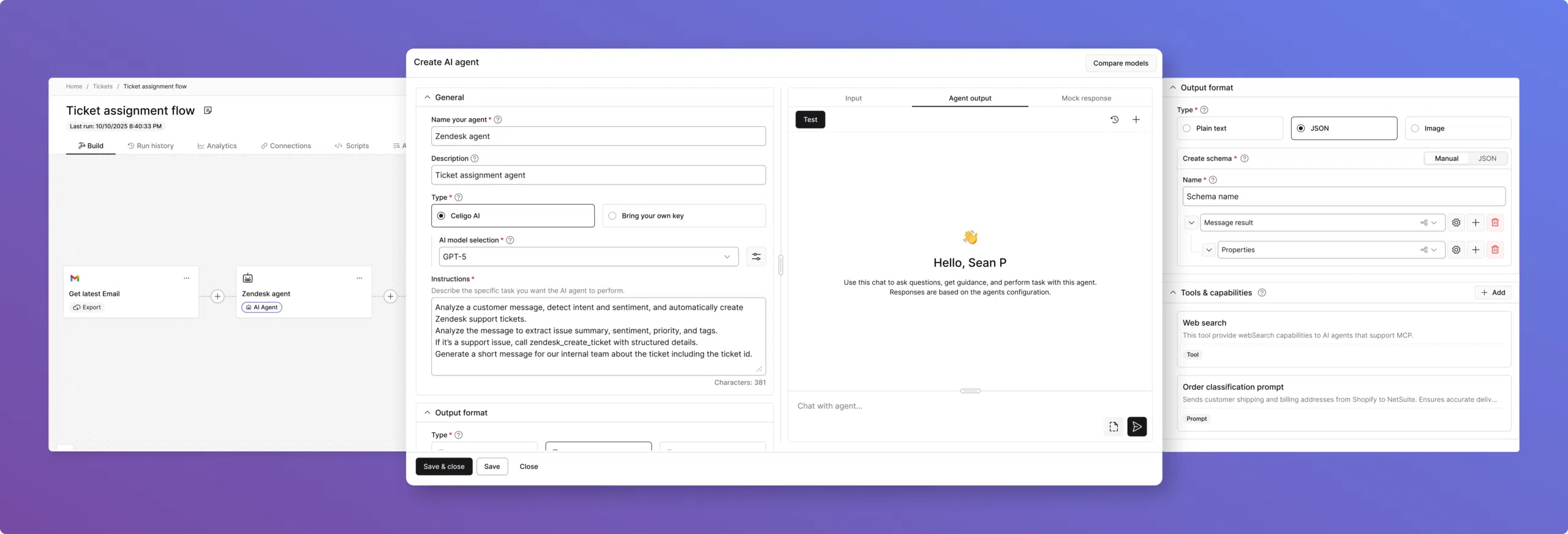
Agent Builder User Interface
Designing Agent Builder to feel native
We started with our FX design system (Celigo’s shared foundation of design tokens, UI components, and interaction patterns). A design system isn’t just a collection of components. It’s a shared language. When design and engineering share the same vocabulary, the same tokens, the same understood behaviors, you stop relitigating foundational decisions every time you build something new.
The system carries institutional knowledge forward so the team can focus on the hard problem in front of them, not the solved ones behind them.
That’s what made Agent Builder possible to approach with confidence. The atoms were already defined: color, spacing, typography, and interaction states. The molecules were already assembled: form fields, panels, modals, status indicators.
When we got to agents, we weren’t asking what a configuration screen should feel like. We already knew.
We were asking something much more interesting: Does this pattern still make sense when the underlying execution model is fundamentally different?
On top of that, the flow patterns transferred more directly than we expected. The connection model, creating a connection, authenticating, and configuring your endpoint, held up almost entirely.
The basic configuration of an import step transferred to: what application, what operation, what data. Users already understood those patterns, so reusing them for agent tools felt natural rather than forced.
If a builder remembers only one mental model after using Agent Builder, what should it be?
That automation can adapt without losing control. The builder is always in the driver’s seat, with the ability to guide the agent, understand its behavior, and review trace logs when needed. That is what builds trust.
What did the “Goals” versus “Instructions” split reveal about how builders actually think about prompting?
In our first prototype, we made a deliberate design decision to split the agent’s instructions into two distinct fields: Goals, which we framed as the “what,” and Instructions, framed as the “how.”
The idea was to simplify the experience by giving users a clear space to define their agent’s persona, rules, and overarching behaviors in one field, and the actual task-level functionality in the other. It felt logical on paper.
But concept evaluation studies quickly humbled us.
Users actually liked the concept of the separation; the idea that you could distinguish between what your agent stands for and what it actually does. That part resonated. What didn’t land was the execution. Users couldn’t confidently figure out what belonged where, and more importantly, they couldn’t visualize how the two fields would come together when the agent actually ran.
There was real anxiety around it — what happens if one field is empty? Do they work independently or together?
What we hadn’t fully accounted for was the mental model our users already carried with them. Most of them had experience interacting with ChatGPT, Claude, or other LLMs, and every single one of those interfaces uses a single text field.
Users don’t think in “goals vs. instructions.” They think in prompts. They each have their own way of writing them, but they’re used to putting everything in one place.
We also realized we’d introduced technical language (like references to Handlebars expressions) that was second nature to experienced builders but completely alienating to users who’d only ever interacted with AI through natural language.
So we went back to the drawing board and simplified radically. We consolidated everything into a single, generously sized text field simply labeled Instructions, with hint text that reads: “Describe the specific task you want your agent to perform.” That’s it. No jargon, no split fields, no ambiguity about what goes where.
It was a humbling but important lesson. Sometimes, the most human-centered thing you can do is get out of the way of what users already know how to do.
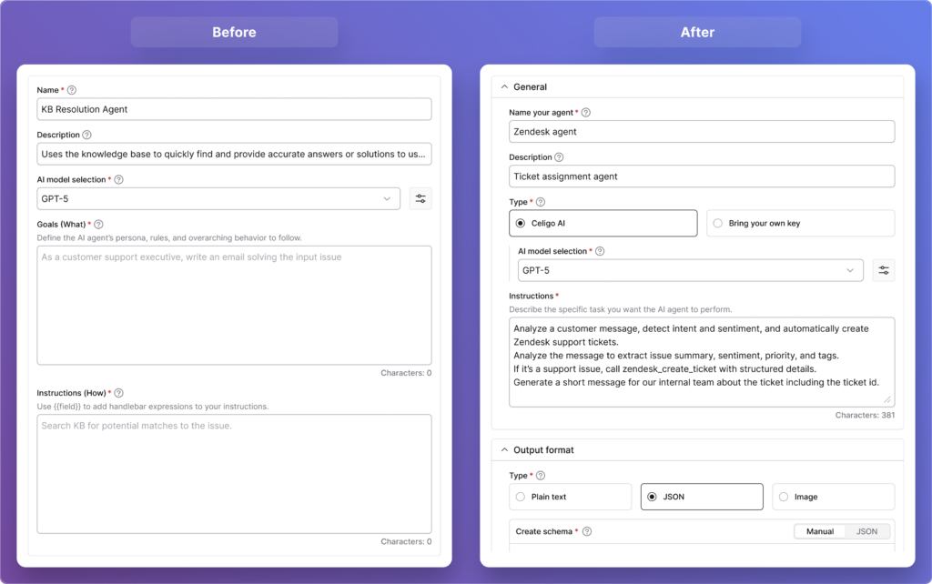
“Goals” versus “Instructions”
How did Agent Trace help turn agent behavior from a black box into something builders could trust?
From the very start, one of our core design principles was simple: users should never feel like they’re handing control over to something they can’t see into. That principle shaped Agent Builder from day one, and it directly led to one of the features we’re most proud of: Agent Trace.
An Agent Trace is like a detailed journal of everything an AI agent does while completing a task. It records the inputs it received, the tools it used, the decisions it made, and the final output, making it easy to understand and debug its behavior.
In our very first prototype, we built a dedicated section where users could see exactly how the agent had executed — the tools it invoked, the data it processed, the raw model response versus the final output presented to the user. We wanted to make the agent’s reasoning visible and auditable, not buried or abstracted away.
What we didn’t fully anticipate was how strongly users would respond to it. The feedback was overwhelmingly positive. Users weren’t just satisfied, they were genuinely relieved. The phrase we kept hearing was that it “wasn’t a black box.”
That reaction told us something important: transparency isn’t a nice-to-have feature in agentic AI. It’s the foundation that makes users willing to trust the agent with real work in the first place.
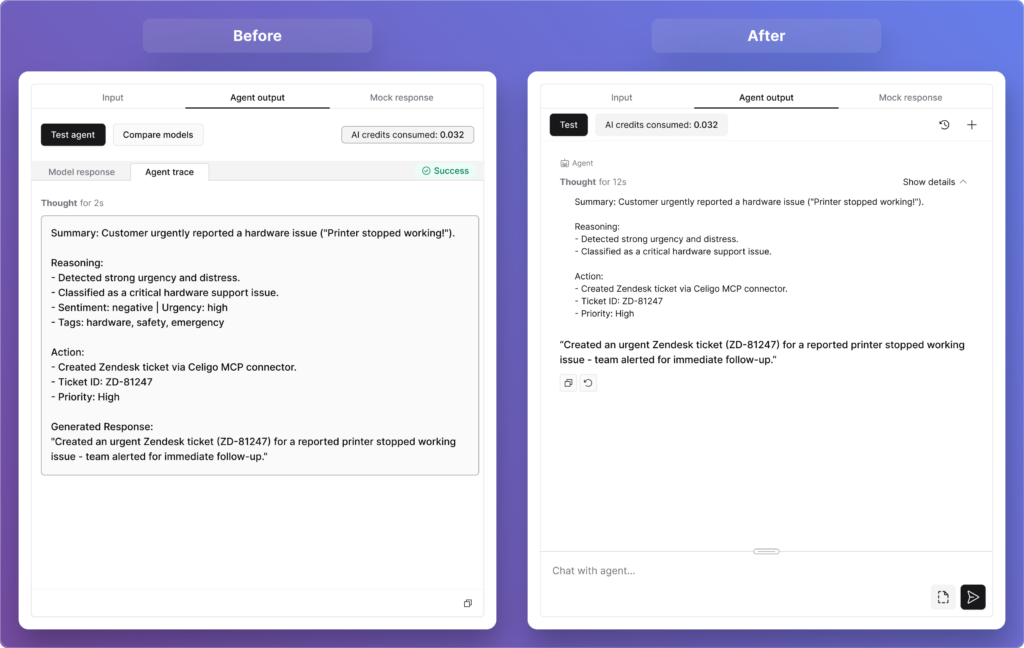
Agent Trace
As the broader industry has come to recognize, an AI system that simply produces results without showing its reasoning doesn’t build confidence; it breeds skepticism.
Users also pushed us further. Several of them asked whether that trace data could be stored historically — so they could go back and audit patterns over time, not just inspect individual runs.
That feedback mapped beautifully onto something we were already building: Execution Logs. That’s a live feature on the platform, giving users a filterable historical view of everything an agent or flow has done, down to the exact request, the response, and how the data was transformed at each step.
It was a reminder that when you design for transparency, users don’t just feel safer. They start imagining possibilities you hadn’t even planned for yet.
What started as confusion around “model response” and “final response” ended up changing the architecture. What did that reveal about how guardrails should work?
On the surface, this looked like a labeling problem. Users were seeing two fields, “model response” and “final response,” and could not clearly distinguish between them. But when we dug into why, we realized the confusion wasn’t about the words.
It was about the underlying architecture we had baked into the design.
Our initial hypothesis was that guardrails should live inside the agent itself — woven into its core reasoning engine. Under that model, the “model response” was what the AI produced before guardrails ran, and the “final response” was what came out after. It seemed logical at the time.
But testing with users (and deeper conversations with subject-matter experts within the company) quickly challenged that assumption. The core issue with embedding guardrails inside the agent is one of objectivity: if a model goes rogue or makes an error, it might simply ignore the constraints it was also supposed to enforce.
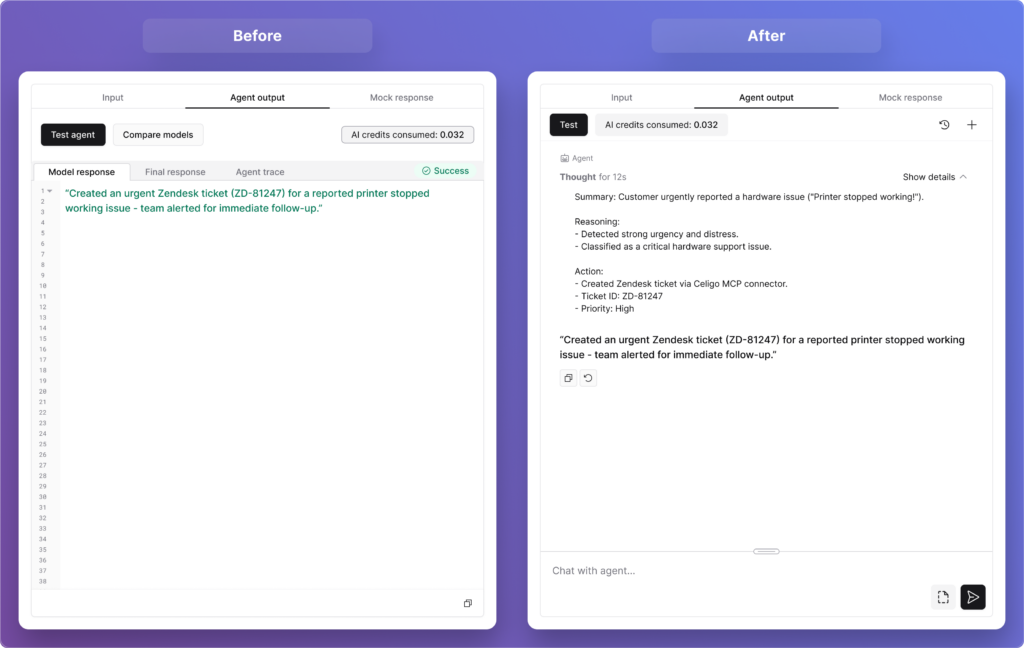
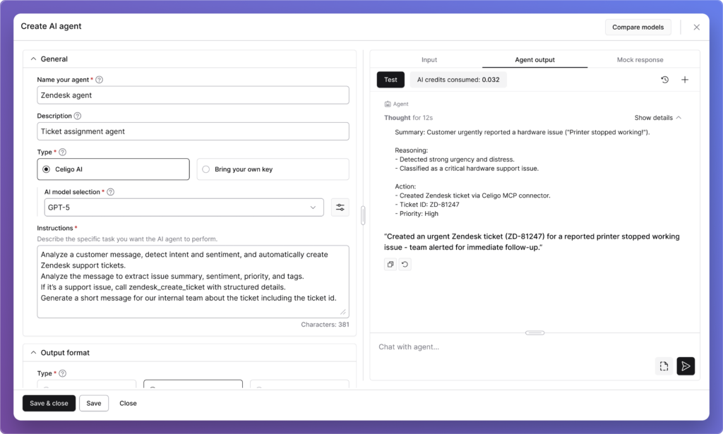
Agent Output
You can’t ask the same engine to both reason and police itself reliably. As one principle from the broader industry puts it well, “prompting is instructing the brain, but architecture is tying the hands. Safety mechanisms need to remain intact even when the agent fails.”
So we made a significant architectural shift. Guardrails moved outside the agent entirely, becoming independent input and output controls that users can place anywhere in a flow, before an agent, after it, or completely independently of one. They’re not part of the agent’s reasoning at all.
And with that change, the UI simplified itself. The distinction between “model response” and “final response” no longer needs to exist. What users now see is simply the agent’s output: clean, clear, and unambiguous. No terminology to decode, no mental model to construct around a two-stage process they couldn’t see.
It was a good reminder that when users struggle with a label, the answer isn’t always better copy. Sometimes it’s a sign that the underlying design needs to change.
What was the most surprising thing that the concept evaluation revealed?
Honestly, the most surprising thing wasn’t about the design at all (that, in itself, was the insight).
We went into concept evaluation fully prepared to hear that parts of the design might feel unintuitive or difficult to navigate. We expected pushback on specific interactions, confusion around certain labels, and maybe some strong opinions about layout. What we didn’t anticipate was a much more fundamental finding sitting just beneath the surface: many of our users genuinely loved what they saw, but struggled to articulate what they would personally build with it.
And to be clear… this wasn’t skepticism about the feature. Users were engaged, curious, even excited. Several of them said it was more powerful and better built out than they had expected. The concept landed well. But when we asked them to connect it to their day-to-day work, many of them hit a wall. Not because the feature wasn’t relevant to them, but because the bridge between “this is impressive” and “here’s exactly how I’d use it in my workflow next week” hadn’t been built yet.
As one user put it, “there’s a knowledge gap between knowing AI exists and knowing how to best use it”, and that’s the gap we had walked them into.
What made this finding so valuable was what it revealed about the broader landscape our users operate in. AI is everywhere right now. In every product, every conversation, every headline. But widespread awareness doesn’t automatically translate into widespread readiness.
Many of our users are talented, experienced integration builders who’ve never had to think about agentic workflows before. They know how to move data between systems. They know how to build flows that run reliably. But designing an AI agent that reasons, decides, and acts autonomously?
That’s a genuinely new mental model, and we hadn’t yet given them the vocabulary or the inspiration to make it their own.
Crucially, this reframed what “done” actually means for us as a design team. Shipping a well-designed agent builder is necessary, but it’s not sufficient on its own. The experience has to extend beyond the interface — into use-case education, guided inspiration, and clear examples of what agents can actually do within real Celigo workflows.
Users don’t just need to know how to configure an agent. They need to see themselves in the story first.
So rather than seeing this as a gap in our feature, we saw it as a gap in our broader user journey, and one that we’re now actively designing for. The Agent Builder itself didn’t need to be rethought. What needed to be built was the pathway that leads users confidently to it: the templates, the walkthroughs, the real-world use cases that make someone say, “That’s exactly my problem.”
That work is now very much part of what we consider the full Agent Builder experience, and this research is precisely what put it on our roadmap.
What should users feel after building their first agent in Celigo?
“They should feel in control. Not in spite of the fact that they just built something autonomous, but because we designed every step of the experience around that very idea.” ~ Nishant Bali
From the moment a user starts configuring their first agent to the moment they watch it run, every design decision is oriented around one question: do they feel they understand what’s happening, and can they intervene if they need to?
That’s a harder design challenge than it sounds. Autonomy and control can feel like opposing forces; the more an agent acts on its own, the more a user may feel disconnected from the outcome.
Guardrails live outside the agent’s core reasoning engine, so safety mechanisms stay intact no matter what the model does. And while new users can write instructions in plain natural language, in whatever language they prefer, advanced users can go deeper with Handlebars expressions for more precise, dynamic control. We designed for the full spectrum of builders, not just one end of it.
Every one of those decisions was a vote for keeping the user firmly in the driver’s seat.
Trust in agentic AI is not given upfront. It is built through small moments of clarity: seeing how the agent reasoned, knowing there is a full execution log if something goes wrong, and feeling in control of the outcome.
Those moments build confidence. And once a builder trusts their first agent, they move from experimentation to operationalizing agentic AI.
Integration insights
Expand your knowledge on all things integration and automation. Discover expert guidance, tips, and best practices with these resources.


